
 |
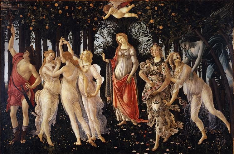
| Title: Primavera By: Sandro Botticelli Date: 1478 Medium: Tempra on panel |
May's challenge is based on Primavera by Sandro Botticelli and it is one of the most written about paintings from the Renaissance. His two most famous paintings are the allegorical subjects Venus in Primavera and the Birth of Venus. Most of his work focused on symbolism, allegory and religious subjects. His paintings were more stylized than other Renaissance artists with elongated features, weightless bodies and unnatural poses. Many of his subjects focused on classical Greek and Roman myths.
I choose to base my necklace on the colors in the painting. The painting has lots of creams, blacks, brown and a little orange red. I was inspired to pull out a lighthouse bracelet bar by Brooke Bock which had the same creams and browns. After looking at it for a time, I decided to use it as a necklace focal. I just snipped some steel wire and filled the tiny hole to make the change from bracelet bar to focal.
 |
| Lighthouse Necklace by BayMoonDesign |
 |
| Size of Lighthouse focal |
What are your thoughts on this necklace? Do you think that I was able to capture the colors?
The cream colors in the painting are so soothing! Love your choice as well as the pops of color! It's an smooth flow design!
ReplyDelete