Showing posts sorted by relevance for query Pantone. Sort by date Show all posts

Thursday, January 18, 2018

We're All Ears :: January Inspiration :: Color of the Year


Photo by Remson Pellisserry on Unsplash
Photo by Remson Pellisserry on Unsplash
Purple tends to be a color that people either love or hate.  I love purple so I was very enthusiastic when I saw that  January's We're All Ears Challenge is focused on purple.  Pantone Color of the year is what they are calling Ultra Violet.  To me it is purple. Since I like purple so much, I have a nice collection of purple beads,  I get to dip into it to make Ultra Violet earrings! 
Pantone color ultra violet

Because I have embraced this color for years, I have come to realize that when designing jewelry you need to take into consideration that there are three distinct purples: Red-Purple, Purple, Blue-Purple. Red-purples are warm, blue-purples are cool, and pure purple is neutral. I have developed some  combinations that I know work with different shades of purple. I love that fact that the Pantone people created  eight different color palettes that feature PANTONE 18-3838 Ultra Violet to help us bring this year's beautiful shade into our designs. All color bases are covered; brights, deeper hues, pastels, mid-tones, and metallics. Each of the eight palettes demonstrate its own distinctive feeling and mood. 

To further inspire your  creativity, within each of these eight color stories Pantone has included three suggested color harmonies. The color harmonies provide examples of how individual colors in the palette can be mixed together and in what proportion. The color bars which make up the color harmony accompany each highlighted color story by Pantone.  These palettes are a wonderful resource for a designer.


I used the Intregue palette for one pair of earrings.  I have a couple of go to favorites that I use when designing jewelry.  One is green so Pantone's Intreue would be a go to palette for me. 


Intregue


Pantone palette Intregue


Modern purple and green earrings by BayMoonDesign
These handmade purple and green earrings combine beautiful artisan modern lampwork and Swarovski crystals with silver. The violet and silver earrings have an organic and modern look to them. This silver, purple and green color palette is perfect for the lampwork by SRA artist Sue Kennedy.  The earrings are available for purchase HERE.


Purple Haze


Pantone color palette Purple Haze


Purple and lilac earrings by BayMoonDesign

My other go to favorites that I use when designing jewelry with purple are Ultra Violet and Misty lilac.  The Pantone palette Purple Haze is another palette that has my favorite purple combinations. The purple and lilac earrings have textured ceramics by Marsha Neal Studio.  If you would like to purchase these earrings they are available at BayMoonDesign.

photo of a purple drink by Neven Krcmarek on Unsplash
Photo by Neven Krcmarek on Unsplash
I intend to grab a warm purple beverage and enjoy seeing what everyone made with my favorite color.

Tuesday, January 16, 2024

PANTONE 13-1023 Peach Fuzz::Color of the Year


                                                     PANTONE 13-1023 Peach Fuzz

                                                        Photo by Markus Spiske on Unsplash

The PANTONE 13-1023 Peach Fuzz is the Color of the Year. Executive Director, Leatrice Eiseman of the Pantone Color Institute of the Pantone says: "In seeking a hue that echoes our innate yearning for closeness and connection, we chose a color radiant with warmth and modern elegance. A shade that resonates with compassion, offers a tactile embrace, and effortlessly bridges the youthful with the timeless."

It has a romantic feel to it. This shade has a peach hue softly nestled between pink and orange. PANTONE 13-1023 Peach Fuzz evokes a new modernity. It is also a quietly sophisticated and contemporary with an understated but impactful beauty. If you would like to explore the Color of the Year more, please click HERE.  I have written a number of blogs about the Pantone Color of the Year that are available for you to refer.


                                        Color Palette for Design Challenge

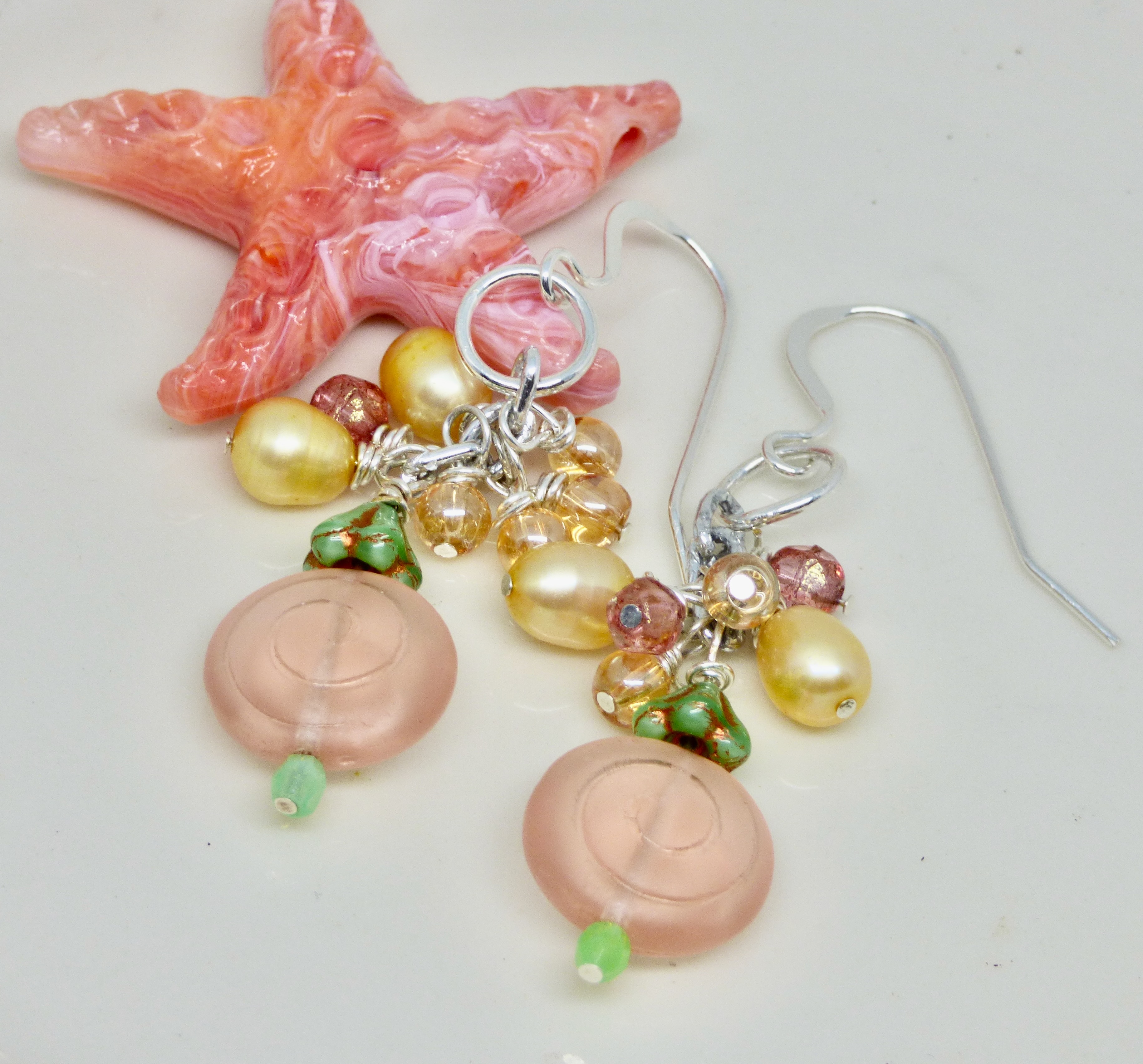
I started  the year with a design challenge centering on the Pantone Color of the Year peach,. This color palette inspired my first earrings for 2024 and I feel they hit the mark. I took an vintage style and gave it a contemporary look and incorporated the colors in the challenge palette.
 
                                                    Peachy Floral Earrings by BayMoonDesign

These are pretty peach cha cha earrings that have faceted pastel rose and tiny shimmery peach glass crystal beads along with creamy yellow pearls.  There is a large peach circular Czech bead with a green bead cap at the top and a green bead at the base. Everything is meticulously wire wrapped. It reminds my of a pretty spring flower. The drops hang 2 inches on sterling silver earwires.

Imagine wearing these gorgeous floral earrings for that special occasion like a wedding or prom. These earrings are perfect for a special outfit or occasion or gift.
If you are interested in purchasing these earrings it can be purchased in my Baymoondesign Etsy shop.
. 
What do you think of the color? I would love to read your comments.

Wednesday, February 16, 2022

Very Peri:: Pantone Color of 2022

                                                   Pantone Color of the Year 2020- -Very Peri

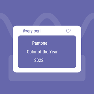
My February 2022 blog is about the Pantone Color of the Year --Very Peri. Pantone said that this year marks the first time it has created an entirely new color instead of choosing one from its roster. Very Peri can be described as a periwinkle blue hue with a violet red undertone.   Pantone said Very Peri is the “happiest and warmest of all the blue hues”   It is a fusion of a dynamic peri (winkle) blue and a vivid violet-red undertone. The color creates a new shade or purple. It is meant to symbolize transition and new possibilities.  


Since Pantone just released this new color, you may not be able to find items in the exact shade yet.  Since I love purple, I have a pair of earrings that I feel hit the mark.


                                                   Very Peri Earrings by BayMoonDesign

These round purple earrings have textured ceramics that give them a modern geometric look. A lilac crystal sits on top the Pantone color of the Year Very Peri colored ceramics. I used sterling silver in my wire wrapping. The ear wires are sterling as well. I love how the color of the boho ceramics looks with silver. These earrings are 2 inches and are light and comfortable to wear.

The artisan ceramics are made by Marsha Neal Studio.

These make a great handmade and artisan gift to yourself or a fashionista friend.

What do you think of the color? I would love to read your comments.

Friday, January 15, 2016

We're All Ears January Challenge Uses Pantone Colors Forecast for Spring 2016


Pantone Spring Colors of 2016

What colors do you like from the 2016 Pantone Spring color forecast? What will you be wearing - or creating with - in the coming year?  The We're All Ears Challenge for January is to use the spring 2016 palette to create earrings with.

The Pantone color of the year for 2016 has been announced... and it is a DUO-- Rose Quartz and Serenity.  This is a pair of colors that can work in tandem and blend and morph as is illustrated in the picture above.  I am going to sit back and see how others use these colors together. 


Pantone Spring Colors of 2016
We are told on the Pantone site that this year's palette features color choices that are unisex to reflect a shift in cultural and gender norms. These color choices for both men and women are meant to evoke "a desire to breathe and reflect, then play." 

For this challlenge, I decided to select from the other colors.Here is what the Pantone Color Institute has to say about the top 10 colors for 2016:
  • The soothing, calming nature of colors in the Spring collections are led by Rose Quartz, a persuasive yet gentle tone that conveys compassion and a sense of composure. Like a serene sunset, flushed cheek or budding flower, Rose Quartz reminds us to reflect on our surroundings during the busy but lighthearted spring and summer months.
  • The fashion and design communities, and consequently, consumers, have been in love with orange for several seasons. Coming to the fore this Spring is, Peach Echo, a shade that emanates friendlier qualities, evoking warmth and accessibility. It is an all-encompassing, tempered companion in the playful orange family.
  • Weightless and airy, like the expanse of the blue sky above us, Serenity comforts with a calming effect, bringing a feeling of respite even in turbulent times. A transcendent blue, Serenity provides us with a naturally connected sense of space.
  • A maritime-inspired blue, Snorkel Blue plays in the navy family, but with a happier, more energetic context. The name alone implies a relaxing vacation and encourages escape. It is striking yet still, with lots of activity bursting from its undertones.
  • While the majority of the Spring/Summer palette trends toward calmness, a few diversions from the theme emerge that offer a contrast. With Buttercup designers reveal a shining beacon transporting its wearer to a happier, sunnier place.
  • A shade of aqua that leans toward the green family, Limpet Shell is clear, clean and defined. Suggestive of clarity and freshness, its crisp and modern influences evoke a deliberate, mindful tranquility.
  • As in most any season, the need for neutrals arises. Essentially a basic, the subtlety of the lilac undertone in, Lilac Gray, adds a distinctive edge to this classic gray shade.
  • The high energy Fiesta is a harbinger of excitement, encouraging free-spirited exploration to unknown but welcoming locales. A strong and fiery, yellow-based red, the vivid Fiesta provides a stark contrast to the calming, softer nature of this season’s palette.
  • A transitional color that will take us through the seasons, Iced Coffee manifests as another strong neutral for the season. With its natural earthy quality, the softness and subtlety of Iced Coffee creates a stable foundation when combined with the rest of this season’s palette.
  • Green Flash calls on its wearer to explore, push the envelope and escape the mundane, radiating an openness that combines with the rest of the palette in unexpected but serendipitous ways. The popularity of this brilliant hue is representative of nature’s persistent influence even in urban environments, a trend continuing to inspire designers.
It seems to me that these colors are fairly close to the 2015 colors, but in a bit more vibrant palette. 

snorkeling in Key Largo, Florida
Snorkeling in Ocean Waters off Key Largo, Florida
Being a snowbird and living in Key Largo, Florida for the winter, I am influenced by the beauty of nature here.  I love the limpet shell color since in reminds me of the waters here.  I also love seahorses and they are a favorite motif of mine so I embossed some metal blanks with seahorses and applied some patina and sealant.  I added some beads that look like sea glass. These seahorse earrings are available for purchase HERE.

limpet shell seahorse earrings
seahorse earrings by BayMoonDesign

The snorkel blue color is another color that I see in the Florida Key waters. I paired the blue sodalite stone with tiny sterling silver hearts and ear wires to create a unique and modern look. These pretty blue earrings have a romantic look to them. I think they are perfect as a Valentine gift or birthday gift.
Sodalite is thought to bring out compassion and love. These are all good things that the world needs more of! The earrings are available for purchase HERE.


I love the water and shades of blue so these are two colors that I know I will use in my spring 2016 collection of jewelry.  What colors call to you?


Thursday, January 12, 2017

We're All Ears January Challenge


Pantone color greenery


This January's We're All Ears challenge revolves around the Pantone color of the year--greenery.  It also happens to be my favorite color which is why I was only to happy to get out my patinas.

According to the Pantone website the color is a refreshing and revitalizing shade.  Greenery is symbolic of new beginnings.
photo of ferns
photo credit:  https://unsplash.com/@insolitus
Greenery is a fresh and zesty yellow-green shade that evokes the first days of spring when nature’s greens revive, restore and renew. Illustrative of flourishing foliage and the lushness of the great outdoors, the fortifying attributes of Greenery signals consumers to take a deep breath, oxygenate and reinvigorate. 


Chartreuse and Green Fern Earrings by BayMoonDesign
                   Chartreuse and Green Fern Earrings by BayMoonDesign
This description of green by Pantone is the inspiration for my first pair of earrings.  I love seeing ferns come back to life in the spring. I made these
 fern earrings from natural brass sheets that I embossed with the fern pattern.  I love the look of the greens in these leaf earrings.  The chartreuse in the fern is picked up in the chartreuse Czech beads.  The green earrings are hand painted with patinas. The metal has a protective coating to keep the color vivid for years to come! I have hung them on brass ear wires and added green beads at the top.  These green leaf earrings are a perfect gift for the outdoors lover.

photo credit:  https://unsplash.com/search/urban-green?photo=5tpf6dSY6WU
Pantone describes greenery as nature’s neutral. The more submerged people are in modern life, the greater their innate craving to immerse themselves in the physical beauty and inherent unity of the natural world. This shift is reflected by the proliferation of all things expressive of Greenery in daily lives through urban planning, architecture, lifestyle and design choices globally. A constant on the periphery, Greenery is now being pulled to the forefront - it is an omnipresent hue around the world. 

A life-affirming shade, Greenery is also emblematic of the pursuit of personal passions and vitality.


Olympic Park, Rio
photo credit https://unsplash.com/@mzeketv
Olympic Park, Rio

I think this design in the Olympic Park, Brazil, is a perfect example of green being used in an Urban setting.  The Olympic games are a perfect example of personal passion and vitality.  After the Olympic Games in Rio were over, photographer Martin E. Sanchez captured the tip part of the Olympic Park there which was designed as a Live Site where everyone would gather and large televisions would broadcast the events. Seeing it from the ground was one thing. But he knew that the real magic was from up above so he took this aerial photo.  The greens and reddish browns inspired this pair of these green fern earrings.

Green fern earrings by BayMoonDesign
This leaf jewelry is nature inspired and are perfect casual green earrings. These green leaf earrings are a perfect gift for the outdoors lover.  Both pairs are available for purchase in my online BayMoonDesign Shop.


photo of greens
https://unsplash.com/search/green?photo=SdEDmcrJOE4

Just wondering --what shade of green is your favorite?

Friday, January 17, 2020

We're All Ears :: January Inspiration :: Color of the Year

Classic Blue-Pantone Color of the Year

January's inspiration for We're All Ears blog hop is the Pantone Color of the Year. This color is a timeless and enduring blue. It is Classic Blue and it is elegant. Blue gives us a sense of peace and tranquility. It is a very grounding color. Classic Blue is a neutral color in my mind. I cannot think of any other color that would NOT look good when paired with it. It reminds me of the color of blue jeans. I think of blue jeans as something that I can pair with any color.


There are a number of color palettes that Pantone has put together to use with Classic Blue. For a pair of earrings that I made, I selected the Exotic Tastes palette for my color inspiration.


A palette that compliments Classic Blue

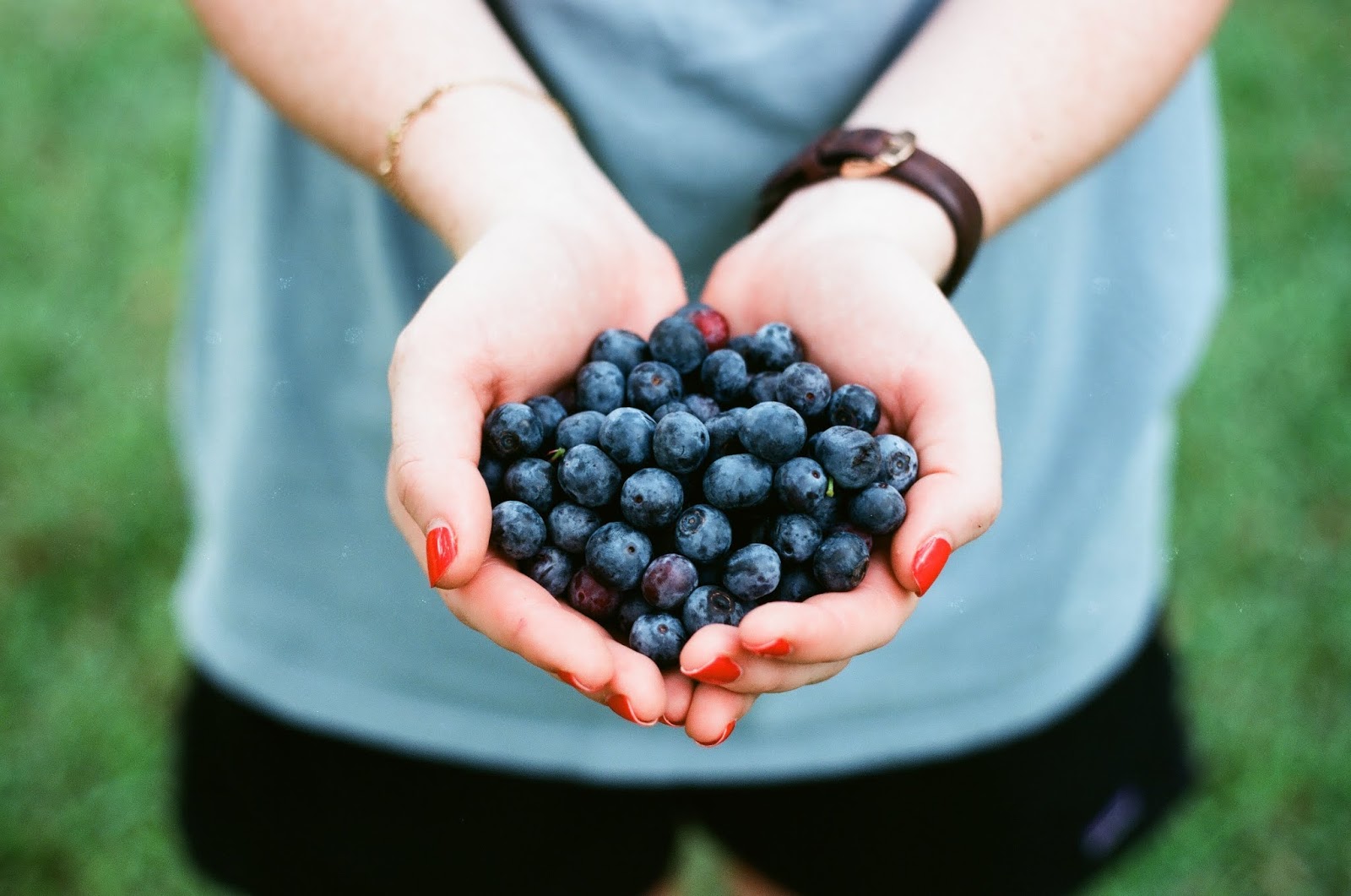
This palette is an intriguing and adventurous potpourri of tastes and colors reflective of natural seasonings, condiments and blue foods. Foods that are a similar blue as PANTONE 19-4052 Classic Blue are rich in anthocyanins. Blueberries are a good example.


Blueberries
Blueberries


These blue moon earrings make a celestial statement with pops of white, orange, yellow.  The colors were inspired by the Exotic Tastes palette. The blue moon was made by Brooke Bock. I added yellow, orange and white o beads that I purchased from My Elements. I think they create a whimsical look.  The earrings have sterling silver ear wires.  


Blue Moon Earrings by BayMoonDesign

I am looking forward to seeing what colors others use with Classic Blue.  What do you think of my color combinations?


Thursday, January 17, 2019

We're All Ears :: January Inspiration :: Color of the Year 2019 Living Coral


Photo of coral reef by James Thornton on Unsplash
Photo by James Thornton on Unsplash

The We're All Ears January challenge is for January 2019 is to use the Pantone Color of the Year 2019 --Living Coral. Living Coral is truly an energizing and vibrant color found in nature. PANTONE Living Coral calls attention to our underwater reef systems. Beneath the sea, this warm and vivid color is spell binding and vibrant. It is namesake of an endangered species in our oceans that we need to fight to protect. The reefs are important because they provide shelter to diverse ecosystems that are crucial. They are too beautiful and important to loose. I love snorkeling in the Florida Keys. My favorite spots are just down the road from where I winter in Key Largo, Florida.  I love to snorkel at the reefs that are part of John Pennekamp Coral Reef State Park which is made up of 70 nautical square miles. While many visitors view the park’s colorful coral reefs and teeming marine life on glass-bottom boat tours, you can get a closer look by scuba diving or snorkeling. The water is so clear that when canoeing and kayaking through the park's waters you can see the underwater world too.


photo of author snorkeling
Me snorkeling

Pantone put together 5 color palettes that feature the living coral color. I often use them to help me make decisions on colors for my jewelry. One of the five palettes that I am most drawn to is --Focal Point. I love the combination of earthy colors that are combined here. I used this Focal Point palette to inspire a new pair of earrings.


Pantone Focal Point Colors 2019

I selected red ceramic pairs by Marsha Neal Studio. The vertical lines in them are the color living coral and reminds me of coral. Since these coral lines are surrounded by an even more vibrant shade I used the cooling color of golden lime. For my metal sterling silver seemed a perfect choice. The silver reminds me of the cooling Pantone color storm gray.


Coral Earrings by BayMoonDesign
I connected coral color ceramics with stacked Czech Glass lustered avocado spacers with 20 gauge sterling wire and added sterling ear wires. These are bold earrings in this seasons freshest colors. They are available for purchase HERE.
You can see additional earrings in my shop by visiting http://www.etsy.com/shop/BayMoonDesign.


Photo coral reef by Tomoe Steineck on Unsplash
Photo by Tomoe Steineck on Unsplash

Pollution, disease, invasive species, and unaware tourists all cause them harm. Coral reefs control the amount of carbon dioxide in the ocean, making them critical to the food chain.

There are ways that you can help protect coral reefs. Something that everyone can do is conserve water. This is essential because less water consumption means that there is less runoff. Less runoff naturally leads to less wastewater finding its way into the sea and affecting the coral reefs negatively.

As a tourist:
Avoid striking or touching a coral reef.
Don't fish or boat near a coral reef
Don't litter on the beach or in the ocean

Coral reefs provide food and shelter for a variety of marine life. They are also important for people who live near the water and rely on the corals for food. Corals are also used to produce medicine, generate tourist revenue, and serve as a barrier against tropical storms for some communities. All strong reasons, to care for them.


This is a blog hop, so please head on over to Earrings Everyday to check out the earrings that other designers have created.

Tuesday, August 23, 2016

Fall Pantone Colors Abound in August Art Bead Scene Challenge

Pantone Fall Colors

When I saw the August's Art Bead Scene Challenge inspiration piece it reminded me of Pantone's color picks for Fall 2016.  I love the vivacious colors--especially the pinkish purple.  and the earthy green.  The Pantone colors make me happy alive!


"Park Near Lu"
By Paul Klee, 1938
Oil and coloured paste on paper on jute; original frame strips

In the inspiration piece by Paul Klee, the artist gives us his impression of a park near Lucerne, Switzerland.  You can see there is a contrast between the hard black bar strokes that represent the tree branches and the bright colors of the spaces between them.  Spring and winter, death and blossoming are portrayed in equal amounts.  I really like the colors here.  These colors make me happy.  I love the peach, teal, lilac colors.  When making jewelry recently, I  have been using black and gray gunmetal so I was happy to see those colors in this.
Happy Bird Necklace by BayMoonDesign
I have to confess, I made about 6 necklaces before settling on this design.  I almost gave up.  Each necklace included the focal with the cute bird by Heather Powers of Humblebeads, the leaf which has "Be happy" is by Green Girl Studios, and the lilac bead that I made in a class taught by Heather Powers.  I thought that the leaf was perfect for this necklace because I wanted this necklace to scream "Be Happy".  I had to make a trip to Michaels because I needed gray gunmetal chain and I had to have peach beads.  None of my beads in my stash were the right color.  When I added those two items to the mix, the necklace started to work.  I was so happy with it that I decided to add a special birds nest clasp.  Somewhere I bought what looks like a silver nest and I also had a silver branch.  I combined them and added a silver leaf to an "extra" hole on the branch.  What wasn't a set worked out to be a pretty cute as a clasp.  The necklace is available in my shop HERE.

How do you like the colors and the necklace?  


Friday, January 31, 2020

January Art Elements Theme Challenge – Berries Berries Berries!

Basket of Berries
Basket of Berries

When I saw the theme for January's Art Element Challenge is berries, I committed to participate right away. Artist and designer Karen Totten issued the challenge and I knew this would provide me with the opportunity to buy some beads for the spring season.

I'm already planning and creating my spring jewelry. I think berry earrings will be perfect as spring earrings. The color palette of strawberries, blueberries, raspberries, blackberries, juniper berries sounds so appealing!

I located some beautiful lampwork berries from ChristianeImkamp . I was taken by how real they look. I came up with three different designs for three different berries. The earrings went together quickly after that.


Strawberry Earrings by BayMoonDesign

These are beautiful lampwork strawberry earrings with sterling silver ear wires. The red berry dangles look like real fruit. I think they would make a lovely Valentine gift.


Red Raspberry Earrings by BayMoonDesign

These are glass red raspberry earrings with natural brass leaves and ear wires . The berries look like they were made by nature. The art jewelry is perfect for fans of berries and foodies.

Pantone Color of the Year for 2020

As it happens, a gorgeous blueberry color is the Pantone Color of the Year: Classic Blue. My blueberry earrings are using this new hue.

Blueberry Earrings by BayMoonDesign

These are glass blueberry earrings with sterling silver ear wires. Each lampwork blue berry has a sterling silver leaf charm with it. This is a beautiful piece of fruit art jewelry. It is perfect for a Valentine or spring gift.

A special thanks to Karen Totten for this fun theme.

This is a blog hop so please visit the other participants and leave comments on their creations.

Art Elements Team
Our Guest Contributors

Don't you think that this jewelry is perfect for a trip to the Farmer's Market?